Head of a Woman
 This is a study of a womans head that I did, of someone elses study. The artist is Jacopo da Pontormo (1494-1557) from Florence. I tried to look him up on the internet for more information, but had a hard time finding anything substantial. After doing this I could appreciate the challenge of making the face and body have a soft fleshy feel rather than a wooden look. Something I would like to work on!! As well as the eyes looking soft and in one direction. Anyway, moving on, this is a study and I hope to do more so I can get a better feel for things.
Caught in a Gust of Wind
 This is a painting I did based on a Japanese print from 1887 called "Caught in a Gust of Wind". The artists name is Ginko. I love how the wind is pushing against her, how she holds herself up and gathers up the robe in her hands. The robe is a beatiful pink with bright red for an accent. As I was painting this I began thinking of the movie "Hero" starring Jet Li, and I think it was produced by Quentin Terentino. The cinematography was fantastic and the way the frames were shot seemed like the images on the screen were being painted on. Hard to explain unless you see it, but that made me love the movie so much I saw it twice. I also thought the plot was great. Initially I thought I would be bored by the movie as it is somewhat slow moving, but that kept me watching closely and waiting for what came next. I might have to see it again. Although both times I saw it on the big screen so I am not sure how it would be on my tiny TV.
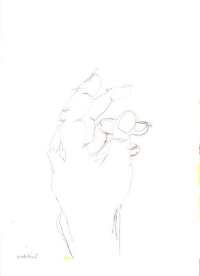
Left Hand
 This is a contour drawing of my left hand. The goal is to not spend too much time looking at the paper, but to focus on the object being drawn. I am also able to scan pictures in now because I have a scanner. The previous images were taken by a camera.
Haystack
 This is a picture of a haystack in our backyard. I was inspired by Monet to take this picture, he did many paintings of haystacks. He did a series of them at different times of the day to capture the light at various times during the day. When I looked up Monet for his haystacks I found this information and found out that the painting shown was inspired by a Japanese print of Mt. Fuji. I did not know that he used these prints for inspiration of his paintings. This is a picture of Mt. Fuji by Katsushika Hokusai. What a great print. I will have to look into this.
Blossoms
 This is a painting based on a Van Gogh painting. I believe they are cherry blossoms but I could be wrong. But I do know they are some kind of blossom. This one is not finished and is in need of repair. It is really difficult to create a similar look to the original because he used oil paint and he would blend the colors of the paint on the surface of the picture to get the intersting texture and depth for the painting that I like so much about the impressionist paintings. The paints I am using are water based and dry very quickly once I apply them to the paper. VanGogh did this one painting of peach tree blossoms based on a Japanese print that I love. I can not seem to find it anywhere to try to work on. Like Mary Cassat and Vincent VanGogh a few of the impressionist painters were influenced by the Japanese prints. The previous post of "The Bath" by Mary Cassat is based on that format. I love the prints as well, I am looking for a few of those to work off also. One of my favorite paintings by Van Gogh is the one he did of a family of potato farmers. It is called the "Potato Eaters". It shows the family eating their dinner. The overall color palette is very dark, just a light to illuminate their faces.
The Cafeteria
 This is a colored in version of a line drawing I did earlier. The image came from a book cover of classic favorite cafeteria lunches in France. Maybe they have better cafeteria food than we do. I was immediately drawn to the combination of the light blue color in the foreground of the table, the brown hair of the boy and the red letters of the title. I could not resist having to create these colors on my own and seeing them in relationship to each other. I am working on my drawing skills, basing my subjects on existing images from other artists or photographs. My goal right now is to just keep drawing and coloring without expectations.
The Bath
 This is a painting originally done by Mary Cassatt. She painted a lot of women and children. This is my drawing based on her original.
 This is a study of a womans head that I did, of someone elses study. The artist is Jacopo da Pontormo (1494-1557) from Florence. I tried to look him up on the internet for more information, but had a hard time finding anything substantial. After doing this I could appreciate the challenge of making the face and body have a soft fleshy feel rather than a wooden look. Something I would like to work on!! As well as the eyes looking soft and in one direction. Anyway, moving on, this is a study and I hope to do more so I can get a better feel for things.


